Back

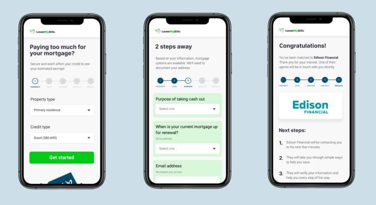
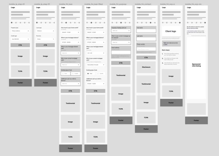
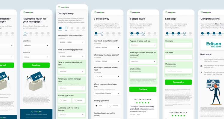
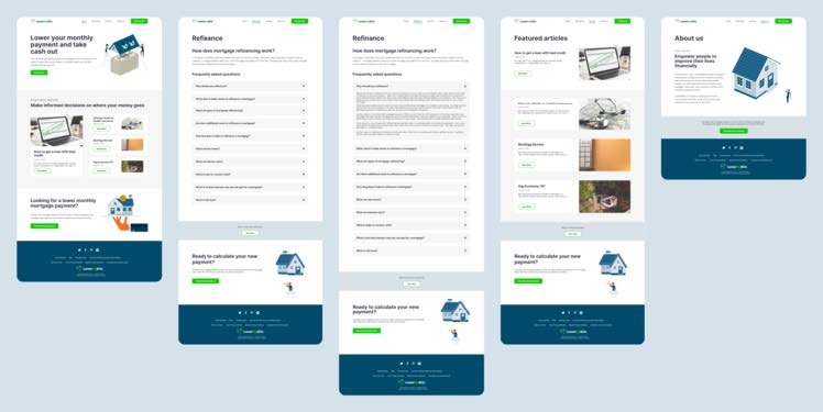
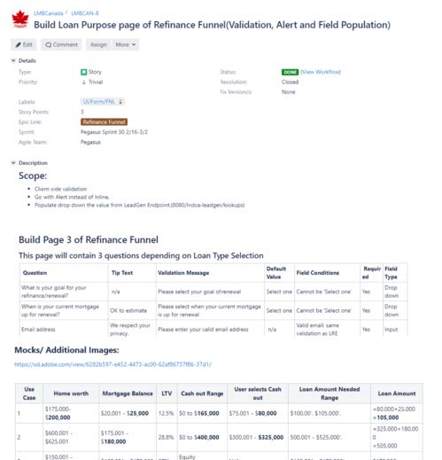
Lower my bills canada
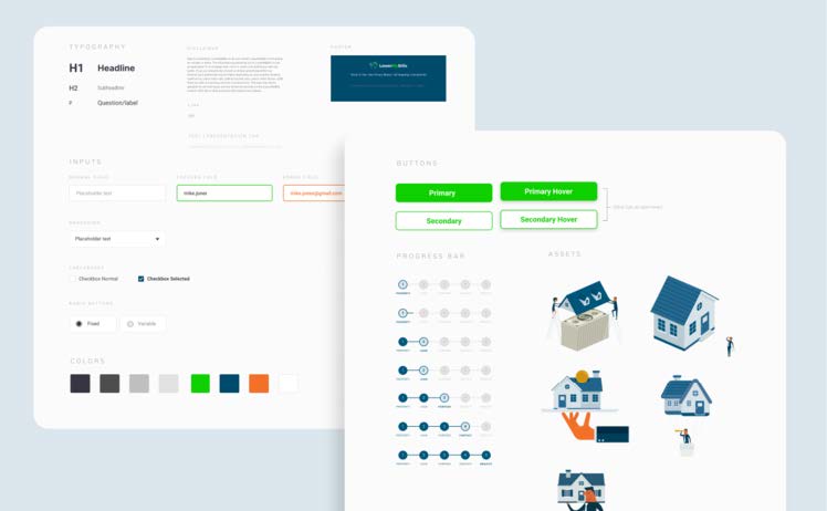
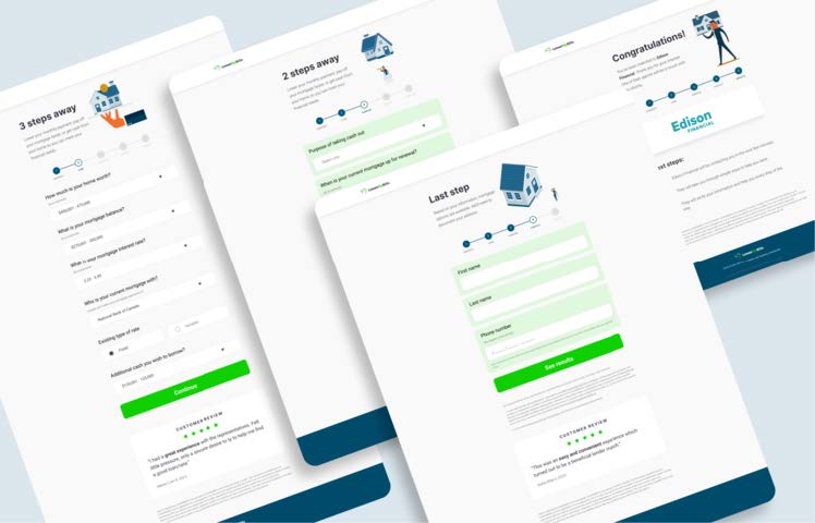
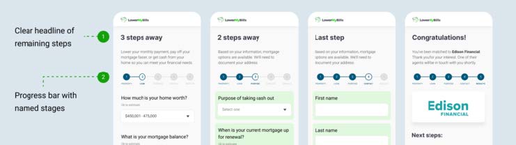
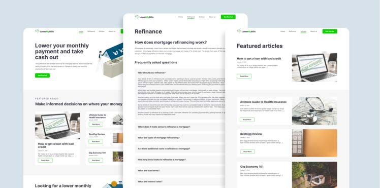
FUNNEL REDESIGN

Core Digital Media (acquired by Rocket Mortgage) built Lower My Bills Canada. During times of lower interest rates, many people are looking to refinance their mortgage. The trend was not only happening in the United States, but in Canada as well. We saw this as an opportunity to start expanding its services. where users can search the best options from a list of lenders. I oversaw user interviews, usability tests, stakeholder workshop facilitations, UX design and AB testing.

Goal

Design the matching tool for users looking to lower their monthly payment in Canada.

PROBLEMS

  • UI inconsistencies & clutter - The current application for the US was a bit overwhelming with text and clutter, and there was no brand consistency. The landing page and funnel experiences were disjointed, and pages contained unnecessary information and elements
  • Unclear expectations - Users were confused about where they are in the questionnaire
  • Lack of resources - There were not enough educational resources within LowerMyBills that would help users better understand the refinance process. By providing helpful articles on our website, we aim to make the process less intimidating and build confidence for our users.

Solutions
Based on the main problems, my focus was to make it as easy as possible to match to a lender that would provide a better monthly rate, while providing support with educational articles about the refinance process.

Easy and simple
Simplify our questions on our match form and provide a more intuitive and easy experience

Best deal
Provide the best deal that we can offer from our network of lenders based on the inputted information

Support
Supply helpful resources for users to learn more about the refinance process and how to navigate through it

Heuristics Evaluation

To tackle the UI issues, I wanted to assess the current design from the web US application with a heuristic evaluation, which are ten general principles for interaction design by Jakob Nielsen. This will allow me to identify what to keep from the US application, and what to improve on for the Canadian application.


Visibility of system status
For the current design, there is a progress wheel component, but it can be deceiving with the percentages and it did not inform which stage the user is currently in.

Match between system and the real world
This is tied to the objective of keeping things simple and easy. We want to use understandable terms and avoid any unnecessary language.

Consistency and standards
In the US product, we see that the button call to actions are not consistent and could possibly set up poor expectations.

Aesthetic and minimalist design
This is also associated with the goal of simple and easy-to-use experience.


design

Low to High Fidelity Mocks


Project Management

I worked closely with the product managers and developers to confirm which data points were needed to pass along to our network of lenders for a lender match.

Requirements
I created the tickets and a master sheet for the development team that detailed the event tracking, and provided mapping of each page along with specifications on information architecture, options values, validation messaging, default values, field conditions, required fields, and field types.

Style Guide
Additionally I provided a Figma Design System for the developers to reference when building out the application.

final

Clean, minimal, and cohesive aesthetic - By updating the UI and brand elements to be more minimal and cohesive, it makes things clearer for users to understand.


Clean, minimal, and cohesive aesthetic - By updating the UI and brand elements to be more minimal and cohesive, it makes things clearer for users to understand.


Helpful articles & FAQ - I worked with the content strategists to come up with helpful articles and an FAQ to help users navigate through their refinance process, so users can feel less intimidated and better prepared to work with a lender.


Back