Back

CHOOSE YOUR MORTGAGE

PAGE REDESIGN

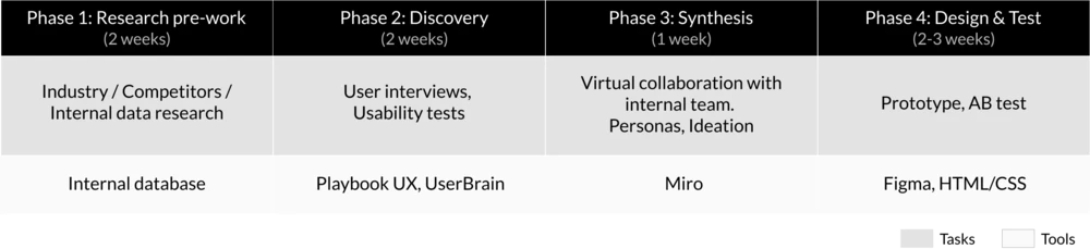
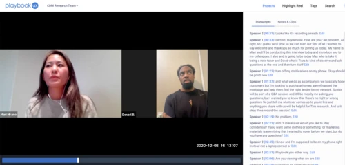
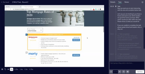
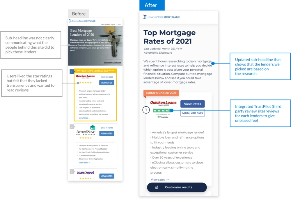
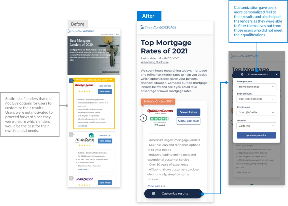
Core Digital Media (acquired by Rocket Mortgage) built ChooseYourMortgage.com, where users can search the best options from a list of lenders. I oversaw user interviews, usability tests, stakeholder workshop facilitations, UX design and AB testing.

Problem Statement

Choose Your Mortgage site had low click thru rate and post click conversion.

Timeline

It took 8 weeks to conduct user interviews and usability tests, lead virtual synthesis sessions with internal stakeholders, build prototypes and develop AB tests.

DISCOVERY
Interviewed 10 homeowners to gain deeper insights into what they looked for when searching for mortgage lenders.


I also ran usability tests to identify what parts of the site discouraged users to proceed forward, and how we could encourage them to get to the final steps of connecting with the lenders.

SYNTHESIS

After the interviews and usability tests, I collaborated with the product managers to synthesize our research. I identified a few trends and discovered that users cared about the following:

Transparency
When it comes to lenders search tools, users wanted to know that the choice of lenders was unbiased. There was lack of transparency in lender orders and how they were selected on our site.

Personalization
What users look for in lenders are different depending on their financial needs, and they felt that the site was lacking the personalization aspect as it was showing a static list of lenders.

Professionalism/Trust
Users felt that our site had a outdated design and felt that there was a lack of professionalism. Users mentioned that tools that they use such as Zillow and Bankrate have professional design and makes them more trustworthy.

DESIGN & TEST

In order to tackle each of the pain points that I discovered through the research, I built the following solutions and ran a few rounds of AB test with the live audience so that I could validate our assumptions before rolling out the changes.

First, I addressed the professionalism/trust by updating the design of the site to be more modern and professional by updating the visual elements such as fonts, images, and color scheme. From there, I went on to address the other two points:

Pain point 1:
How might we help the users feel that they are getting most trustworthy information of value within the page?

Pain point 2:
How might we better tailor the page to the user's financial needs? (make the users feel like they are being spoken to)

RESULTS & LEARNINGS

The updated site generated 13% more revenue per visitor and a 9% higher conversion rate.

Due to the results of this project, I was also able to show the value of research within the company and stakeholders were more encouraged to continue the user centric approach moving forward.

Back